Wednesday, July 14, 2010

Architecture and the Cliche

Even before I was in my first year of architecture I studied drafting and in this class we had to design a building for a ‘client’ who happened to be a fellow classmate. Our brief was a house for a musician, so of course the first thing we did was design a house that looked like a piano, with a guitar shaped swimming pool out the back.


As I entered architecture school we studied design subjects which challenged us to avoid the clichéd and design structures which accommodated the brief as well as made an architectural statement and took account off the context and surrounding community. It seemed that this form of design thought permeated all forms of architectural ideals, ideals that formed a sense of social and community responsibility with quality design and avoiding the clichéd. Or so I thought.

I recently was reading design boom and saw 3D design images for a new residential development in china which attempts to be environmentally conscious and make a comment on the local environment. However it appears that it only does this by imitating it. The structure is made to look like hills in the distance with apartments forced in the shapes to suit the form.

The design images are probably the best thing about this project indicating a ribbon of green with landscape elements and show some thought into incorporating environmental elements into an architectural design. However, in my opinion this ideal has been lost with the forest, and I use the term loosely, of units and balconies. It seems to me to be a very clichéd approach in a nation which is desperately building high density apartment blocks for a rapidly expanding population.
For the full story and all the images go to the design boom story: www.designboom.com
Saturday, July 3, 2010

High School art portfolio

The cleaning continues and now its time to decide what to do with the old high school art projects. To be honest I am surprised it lasted this long, and sadly alot of it, due to general neglect, is a little worse for wear. After throwing alot of it in the bin there are a few pieces which I still have a hard time throwing out, even with its dubious content and skill.

It is funny looking back at the old pieces and seeing some of the early attempts at 'politically motivated' art work. I used to be interested in politics and world affairs. My simple approaches seem childlike with comments such as chemicals in our meat and global warming. In my defence I was a teeanger at the time with lofty thoughts of attempting to change the world. I assumed for the best.

So this is my artist legacy as it stands, and whilst these pieces won;t make it to any art gallery walls modern technology allows me to record it for prosperity. Forever in a blog.

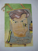
So I never really like my face much - get a new nose haha yeah funny

red shirt blue tie, classic
I must have liked basketball at some stage
Ok so it goes a little something like this, hormones are eaten by the cow delivered courtesy of the multnational drug companies, we get addicted ergo more money for the big boys...get it? hmmmm


Planes falling appart, perhaps I foresaw the collins class submarines debarcle, i knew i must have been ahead of my time
So I actually like this one, my very first stencil and 4 colours! supposedly an advert for a fictional guitar manufacturer - Fever guitars! get the fever!!!
ummmm...i never played dungeons and dragons, I suppose a prt of me always wanted to
A competition entry for a softdrink company, first time I had used an airbrush, and spent so much time on it, but it still looked ordinary. At least I learnt about how to overwork a project and to leave well enough alone.
So theres a bit of a snapshot of my high school art career, naieve but colourful.

Thursday, July 1, 2010

An Homage to a Mirage

Recently my beloved car - the little red rocket - found itself in a car dealers yard as part of a trade in deal for a new vehicle. It has been 10 fantastic years of trustworthy and reliable service from the little car, and the rocket will never be forgotten.

A few last photos before it heads into the unknown, hopefully with a new and good owner and home...with the door, clutch and timing belt fixed p of course. There comes a time when all the strange rattles and noises add up to $$$$$ and its time to move on. So after 253,000 kms it was tme to say good bye.

God's speed little rocket


Tuesday, November 3, 2009

public art

on one of my recent journeys around the city of brisbane had a walk over the new kurilpa bridge and around Donovan Hills Santos Place. Having always been a fan of public art I was happy to see the new piece in the public access.


ONCE, AGAIN, Lincoln Austin, Northbridge Building, North Quarter Lane, Santos Place, 2009

Tuesday, October 6, 2009

Stencils on Paper


These are a collection of the lastest stencil artworks I have produced over the past week or so. A collection of pop culture icons painted with different techniques. Have discovered some interesting images can be produced with spray paint allowing for different textures by allowing more or less paint from the can. Have attempted to combine stencils with interesting backgrounds and textures. These were all done by cutting my stencil images from paper and spraying with aerosol paint. I have started to experiment with 2 layers with varing degrees of success, over spray is a problem. This is where paint creeps under the stencil not leaving a defined edge, and because i am somewhat of a perfectionist about these things it tends to bother me a little. The johnny cash ones I like and the SS Chavelle, however I am hoping to include some australian cars in the future. These originals and some prints will be available for purchase for a modest price at the Darra Fair coming up this sunday from 2pm onwards. Come down and check it out, even if its only to watch Bolt on the bigscreen, I haven't seen it yet so i might be in the crowd pushing small children out of the way. As always comments and suggestions welcome.

Saturday, September 12, 2009

sushi

I Enjoy Painting and I enjoy eating, so theres the ultimate combination. pop art for arts sake.

Friday, September 11, 2009

Fast Food


This is the first in a series of artworks based around ordinary objects in particular fast food. The new family meal is now made up of deals of fast food. The artwork is a combination of pop-art and illustration

Monday, August 17, 2009

Latest Paintings


A selection of my latest paintings trying to get ready for a few shows which are coming up.

Monday, August 3, 2009

Traffic Signal Box

Ok, so sometimes you have to stand back at what you have created and just say 'wow, that is really ordinary'. As is the case in question. Brisbane City Council allows for the traffic light boxes alongside intersections, to be painted with whatever creative idea a local artist come up with. Designs do have to be approved however local members of the community are encouraged to participate. The box I designed centred around the local East's rugby league football club and thecommunity links of sport. However this idea was just prior to all the problems with high ranking professional football players and I subsequesntly lost my passion for the design. However here it is in all its glory...the submitted design is included for reference...


Monday, June 8, 2009

tattoo sketches


beginning draft sketches of tattoo...